At Multitudes, we’ve spent a lot of time thinking about indicators of team success. Everything we measure in our tool is based on conversations with experts on engineering management, research on how to support DEI at work (diversity, equity, and inclusion), and metrics frameworks like DORA and SPACE. In addition, our team has worked as developers, data scientists, engineering leaders, and coaches for engineering teams. Finally, equity and inclusion is at the heart of all that we do; our CEO, Lauren Peate, ran a diversity, equity, and inclusion consultancy before starting Multitudes, and our whole team is committed to unlocking the collective power of teams – a key part of which is ensuring that those teams are equitable.
Our focus is on how to show the holistic view of team delivery, because productivity is about more than just speed and output. As the recent paper on SPACE metrics points out, metrics signal what is important to an organization – and flow metrics alone cannot capture critical dimensions like employee satisfaction, well-being, retention, collaboration, and knowledge-sharing. This is why we not only provide all four DORA metrics but also provide people metrics that look at wellbeing and collaboration.
Read on for a deep dive into our metrics – what they are, why they matter, how we measure them, and how you can get the most out of them for your teams.
To see our metrics in action, try it out for yourself – you can sign up for our beta program here!
⭐️ A star indicates that the metric is one of the 4 Key Metrics published by Google's DevOps Research and Assessment (DORA) team. You can see all 4 key DORA metrics on the DORA Metrics page of the Multitudes app.
👥 A two-person icon indicates that we only show this metric at a team level, not an individual level (e.g., PRs are a team sport!)
What good looks like
As you’ll see below, our metrics show pre-defined benchmarks based on internal and external research. You can read more about the research behind these benchmarks in each metric section below. That said, because each team is different, we allow teams to customize targets.
Process Metrics
Our process metrics cover most common flow and velocity metrics, including all 4 key DORA metrics. We also aim to make our metrics as actionable as possible - so we try to show possible causes of trends, like bottlenecks during reviews, large PR sizes, and whether the team's focus is aligned with the highest priority work. Complementing speed of delivery, we're also interested in quality - how often bugs are released, and how quickly systems are restored after a failure.
Additional notes for deployment metrics
Deployment metrics (e.g., Lead Time if you’d like it to include deploy time, Deploy Time, Deployment Frequency, Deployment Failure Rate) require you to either install our GitHub Actions integration or use our Deployments API for other CI/CD tooling.
If you’re using our Deployments API…
An “attempt to deploy to production” refers to the POST that you’ve sent to our API. For timestamp, we’ll either use:
When naming the deployment, we’ll either use:
- The optional title value if provided, OR
- The title of the most recent PR that matches the deployment (based on the required commitSha value), OR
- The title of the commit itself (if no matching PR is found)
Note that we include everything that is POSTed! For example, if you send us data on 3 deployments with the same commitSha (because. you'd deployed to dev, staging, and prod), we will count this as 3 attempts. That said if we receive multiple deployments with the same commitSha, metrics relating to time (e.g., Deploy Time) will only look at the latest attempt. At the moment, there is not away to delete deployments POSTed, please email support@multitudes.co if a POSTwas made in error.
If you’re using our GitHub Actions integration…
The definition of an “attempt to deploy to production” will depend on how you’ve set up GitHub Actions, so be sure to configure your GitHub Actions integration:
Lastly, to align on the definitions of success and failure:
- Successful attempt = attempt concluded with SUCCESS
- Failed attempt = attempt concluded with FAILURE , TIMED_OUT , or STARTUP_FAILURE
- We ignore other conclusions (i.e., CANCELLED or SKIPPED)
Note that these definitions apply regardless of the nuance expressed earlier across what an attempt is based on how GitHub Actions is used and configured.
Flow of Work
We have several analyses that look at the flow of the work – things like how quickly the team collaborates to deliver work, where delivery is flowing smoothly, and where it’s getting blocked.
⭐️ 👥 Lead Time

- What it is: This is DORA's Lead Time for Changes (abbreviated to Lead Time in the app), a metric that shows how long it takes the team to write code, request and give feedback, make revisions, merge the PR, and then deploy into production. It’s an indicator of how long it takes to deliver value to customers.
- Why it matters: Lead Time is one of the top four indicators of software team performance, according to Google’s DORA unit (the DevOps Research and Assessment unit). Their research shows that a faster Lead Time is correlated with better business outcomes. Specifically, teams with a faster Lead Time do work that is better, more stable, and more secure. If you want to dive deeper into this, check out the Accelerate book. Note that this is closely related to Cycle Time; we measure Lead Time since that's recommended by DORA.
How we calculate it: To calculate Lead Time, we measure the number of hours from the first new commit on a pull request’s (PR’s) branch to a successful attempt of deployment to production for that PR, or to PR merged if there is no deployment data.
*Note that this means some of the PRs included in this chart will not yet be deployed. This is so that you can get insights for all repositories, even ones that don’t have workflows configured. You can get a breakdown of how long PRs are taking to merge vs. deploy with the Lead Time subsets chart or the specific line charts (like this one for deploy time). - What good looks like: Google's DORA research shows that elite performers have a Lead Time of less than 24 hours.
Additional calculation notes for Lead Time & subsets
Here are a few additional notes that affect the calculations for Lead Time and/or its components, Coding Time, Review Wait Time, Editing Time and Deploy Time.
These exclusions apply to Coding Time, Review Wait Time, and Editing Time :
- Our focus is on PRs that the team collaborated on, so we exclude bot merges and selfie-merges (PRs merged by the PR author, with no comments or reviews by other collaborators).
- If you like, you can choose to exclude weekend hours from these calculation; simply toggle on “Exclude Weekend Hours”.
For just Lead Time and Coding Time, please note:
- When you first join Multitudes, your historical data (the first 6 weeks) will show a lower time metric if your company does a lot of rebasing. This is because we can’t get original commits from the historical data in GitHub, so the rebased commit is taken as the first commit.
- Once you integrate, we get events data from GitHub. This means we will get the original commits that are pushed to GitHub, even if your teams rebase or squash the commits later. Therefore, you might notice that your metrics are higher after the time that you onboard onto Multitudes, compared to your historical data.
For just the separate Deploy Time line chart:
How Lead Time is broken into its subsets
Lead Time is broken up into its four components, Coding Time, Review Wait Time, Editing Time, and Deploy Time. Where these start and end can depend on the events in each PR's life cycle. Here is a typical PR timeline. Click the dropdown below it for more scenarios.

👥 Coding Time

Review Wait Time

- What it is: This shows how long people wait to get feedback on their PRs.
- Why it matters: This is one possible bottleneck for Lead Time. When people have to wait longer for feedback, it can mess up their workflow. They’re more likely to start a new piece of work while waiting for feedback. When they get that feedback, they have to context-switch, making it harder for them to remember what they did. This often results in longer times taken for each of the tasks to be completed (for example, one study showed that it takes 10-15 minutes to get back into context).
Moreover, there’s bias in how long different groups of people have to wait for feedback. For example, this research showed that women had to wait longer than men for feedback. This is why we do show this metric at the individual level — so that you can make sure that everyone is receiving feedback in a timely manner. How we calculate it: We measure the number of hours from PR creation until the PR gets feedback. This could be a comment, review, or merge by someone other than the PR author. It excludes time that the PR spends in a draft state, since the draft state indicates that the PR author is still finishing the work. To be clear on some nuances:
What good looks like: We recommend that Review Wait Time be under 4 hours. This threshold is based on an internal analysis conducted by Multitudes across 80,000 PRs from a diverse range of customers and comparing against the SPACE and DORA research.
👥 Editing Time

- What it is: This metric shows how long code takes to get merged once feedback has been received.
- Why it matters: As a measure of back-and-forth between the code author and those who are reviewing the code, Editing Time is important for understanding bottle-necks in Lead Time. A high Editing Time could mean that the team needs to improve how they scope work, the received feedback is confusing, the PRs being created are large, or there are other distractions preventing fast iteration. A low Editing Time indicates that the team is able to quickly action feedback and ship work once it has been reviewed.
- How we calculate it: We measure the number of hours from first feedback on the PR to PR merge, i.e. the back-and-forth editing time. If there was no response before the merge, Editing Time is null. See here for some additional calculation notes that apply from Lead Time.
- What good looks like: We recommend that Editing Time be under 16 hours. This threshold is based on an internal analysis conducted by Multitudes across 80,000 PRs from a diverse range of customers and comparing against the SPACE and DORA research.
👥 Deploy Time
.png)
👥 PR Size

- What it is: How large your team's PRs are. We show two representations of this — Lines Changed and Files Changed.
- Why it matters: This is another possible bottleneck for Lead Time. We know that large PRs are harder to review, test, and manage in general. It is now generally accepted that keeping PR size down is best practice for faster reviews, less merge conflicts (and therefore easier collaboration), and simpler rollbacks if required. Learn more in this 2017 paper by Microsoft and the University of Victoria, and in Google’s own internal guidelines (they say “changelist” rather than “pull request”).
- How we calculate it: We show the median of the lines of code or the number of files changed per PR depending on the option selected. We chose to provide 2 options here (instead of just lines of code) so you can get a more well-rounded view of the overall size. We recognise that these are both simple measures of "PR Size" which don't take into account edge cases such as lock files or automated formatters (examples where PR size may be large, but the PR is still easy to review and manage). However, in the majority of cases, the number of lines or files changed is a reasonable indicator of how long a PR may take to get merged.
- What good looks like: Many organizations like to enforce maximum limits on the lines of code (LOC) changed per PR, generally ranging from around 200 to 400. This study also found that PRs should be limited to 200-400 LOC; beyond that, the ability to effectively capture defects goes down. So we recommend keeping LOC under 300 as a good middle ground.
Files changed varies - you can have a small number of LOC changed across many files, and it'd still be fairly easy to review. In our teams, we try to keep it under 10 files changed .
Value Delivery
⭐️ 👥 Deployment Frequency

👥 Merge Frequency

- What it is: This is an alternative to DORA's Deployment Frequency. It shows the median number of PRs merged per person on a team, over time.
- Why it matters: This is an indicator of the value we're providing to customers, because it shows the volume of work being released to production.
It can be useful to measure both Merge Frequency and Deployment Frequency. While it is best practice for each merge to automatically deploy to prod, often this is not the case - maybe your deploy pipeline is not yet fully automated, or it takes a while to deploy so you often want to batch changes. A significant difference between these two measures might indicate opportunities for improvement in your deployment processes. - How we calculate it: We count the number of PRs merged in each time period, divided by the number of people on the team. This normalization is to allow benchmarking of teams against industry standards, regardless of team size. You can filter for only collaborative PRs (ones that had input from someone other than the PR author) using the Collaborative PRs toggle.
- What good looks like: Google suggests that elite teams should be deploying multiple times a day. If we call that one deployment per day per team, that’s 5 deploys per week in a 5-day workweek. Dividing this by a rough approximation of team size (around 5 developers), and taking into account the fact that there's sometimes more than one PR included in a single deploy (for major features, it could be best practice to collect up lots of changes into a release branch), we recommend keeping this metric over 2 PRs merged per person per week.
👥 Types of Work

What it is: This shows how much of each type of work the team completed To understand more about how “work” and “completed” are defined and customized, click here. You can hover over a specific section of the bar chart to get more details on how many tickets were dedicated to that task
Why it matters: This metric gives you visibility over team velocity and how the team’s work was spread across different types of work. If a team is struggling to get their planned feature work done, this is a useful chart to consult to see what could be getting in the way, and understanding if the types of issues completed align with what was planned.
When people are interrupted on a project, it can take up to 23 minutes to get back on track (e.g., fully shift their thinking, remember where they left off, etc.). The more projects an individual holds, the more they therefore have to “context switch”, which can reduce overall productivity, while also increasing feelings of stress and frustration.
Across the team, the cost can really add up; one academic study found that developers working on 2+ projects spend 17% of their development effort on managing interruptions.
Did the team have enough time for feature work or did bug work get in the way? In one survey of ~1000 developers, 44% said bugs were a key pain point in their day-to-day work and a main reason deployments were slow.
How we calculate it: this depends on your configuration, please click here.
- What good looks like: This depends on your team and product priorities. Many teams value consistency week-to-week, since it helps with their planning. It can also be helpful to watch for increases in bug work, since that can decrease the team’s time for feature work. Overall, the goal of this chart is to make sure your team is working on the most important thing(s) and getting work done at a reasonable pace.
👥 Feature vs Maintenance Work

Customizing Types of Work or Feature vs Maintenance (for Jira or Linear) charts
Each organization works differently. Our custom configuration allows you to accurately understand what work has been completed at your organization, based on issue tracking data from integrations like Jira and Linear. We hope this will help keep teams on track and prioritize work.
First, work “completed” is defined as:
For a Jira integration: work that has been moved to the Done status, or to a custom status in the Done status category.
- For example: if you have custom Jira statuses like Testing, In Staging, Ready for Release, and Released, and the last 2 statuses are both in the Done category, then we count number of issues moved either to Ready for Release or Released.
For a Linear integration: work that has been moved to Done. You can select to count either number of issues or total story points using the toggle on the chart.
Second, “work” completed can be very flexibly defined by you!
For a Jira integration: work can be defined by using Issue Type, Epic, and/or Label (you can not select Sub task or issue types of custom hierarchy levels).
We will only show epics that are currently in an “open”-type status.
- If you define a category using an epic that later gets closed, the chart will still show the issues in that closed epic for that category, until you decide to remove this epic from the category definition.
- If you remove the closed epic from your configuration, it will disappear from the epics dropdown and you will no longer be able to use it.
- Our default for Types of Work is to categorize issues by Issue Type. The Jira defaults for this are Story, Bug, or Task, but you may have your own custom issue types.
Our default for Feature vs Maintenance is to categorize issues by Issue Type, where issues called bug, tech debt, or chore are displayed in various shades of purple, to indicate that it’s all Maintenance work. All other issues are grouped into the green Feature work.
- Note that an older release of this chart defaulted to categorizing issues based on whether it contained a string called bug, tech debt, or chore. Now, the config default will look for an exact match (of course, configurable!).
For a Linear integration: work can be defined by using Project and/or Label.
- Our default for Types of Work is to categorize by Project.
- Our default for Feature vs Maintenance is to categorize by Project, where projects called bug, tech debt, or chore are displayed in various shades of purple, to indicate that it’s all Maintenance work. All other projects are grouped into the green Feature work.
- You can define categories of work based on combinations of OR and AND conditions. For example, you can define a custom work category, Customer Support, that is defined as where an Epic is Support, and the Label is one of Customer Apple, Customer Grape, Customer Peach.
- Configure these categories based on how your teams think about where your time goes. This will help to see at-a-glance where your team’s split of time is what you would expect.
Specific notes about custom configurations on how "work" is defined:
- Each chart’s configurations are organization-wide.
For now, we do allow categories to overlap:
- If you define a custom work category called Support which includes work where Label is Customer, and another custom work category Customer which also includes work where Label is Customer, then work completed with a Label that is Customer will be counted in both categories.
- This helps some companies that prefer to have an accurate relative comparison of work across categories.
- In the Feature vs Maintenance chart only, we will flag this discrepancy because it means some issues are being double counted, and it inflates the total issues done for that week or month (to over 100%).
For now, we handle work that falls outside custom categorization differently across the two charts:
Quality of Work
⭐️ 👥 Change Failure Rate

- What it is: The percentage of PRs merged that indicate that some kind of failure was released and had to be fixed.
- Why it matters: This is our take on DORA's Change Failure Rate, which indicates the percentage of deployments that cause a failure in production. It's a lagging indicator of the quality of software that is being deployed - how often does it contain bugs that cause failures later?
- How we calculate it: We calculate the % of merged PRs that contain any of the words rollback, hotfix, revert, or [cfr] in the PR title, out of all merged PRs. We tested and chose these keywords to catch most cases where a PR was required to fix a previously-released bug, while minimizing false positives.
We recognise that this proxies failures after the fact; this is because it's not actually possible to know if someone's releasing a failure into production in the moment, otherwise it wouldn't have been released in the first place! Also, incidents are not always easily tied to a specific PR or deployment.You can include the square-bracketed keyword [cfr] in your PR titles if you'd like more granular control over what gets counted in this chart. - What good looks like: Google suggests that elite teams should aim for a change failure rate of 0%-5% (originally 0%-15%).
⭐️ 👥 Mean Time To Recovery
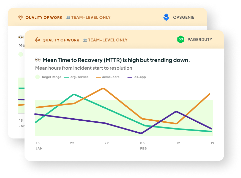
- What it is: This is our take on DORA's Mean Time to Recovery metric. It's a measure of how long it takes an organization to recover from an incident or failure in production. You will need to integrate with OpsGenie or PagerDuty to get this metric.
- Why it matters: This metric indicates the stability of your teams’ software. A higher Mean Time to Recovery increases the risk of app downtime. This can further result in a higher Lead Time due to more time being taken up fixing outages, and ultimately impact your organization's ability to deliver value to customers. In this study by Nicole Forsgren (author of DORA and SPACE), high performing teams had the lowest times for Mean Time to Recovery. The study also highlights the importance of organizational culture in maintaining a low Mean Time to Recovery.
- How we calculate it: We take a mean of the recovery times for the incidents that occurred in the selected date range, for the selected cadence (e.g. weekly, monthly). The line chart series are grouped by Multitudes team for Opsgenie, and Service or Escalation policy for PageDuty.
The recovery time is calculated as follows:
On OpsGenie: the time from when an incident was opened to when it was closed.
On PagerDuty: the time from the first incident.triggered event* to the first incident.resolved event. We attribute the incident to the team(s) of the resolver; this is the user who triggered the first incident.resolved event. This is how we determine whether to show an incident based on the team filters at the top of the page
*If a trigger event can not be found, we default to the incident's created date. This is the case for historical data (the data shown when you first onboard).
Also, in historical data, the resolver is assumed to be the user who last changed the incident status; you can't un-resolve an incident, so for resolved incidents this can be assumed to be the responder. - What good looks like: DORA research shows that elite performing teams have a Mean Time to Recovery of less than 1 hour.
👥 Number of Pages
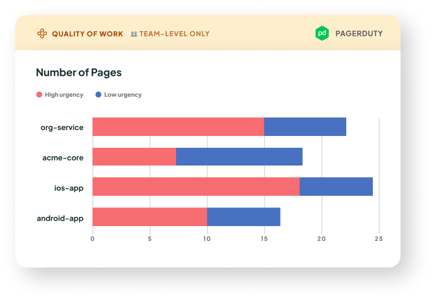
- What it is: This is the number of pages grouped by service or escalation policy. You will need to integrate with PagerDuty to get this metric.
🌱 Coming soon to our OpsGenie integration - Why it matters: This metric indicates the stability of your teams’ software. More pages means more incidents, and therefore disruptions to your team's focus. By looking at which services and escalation policies are generating the most pages, you can tune your monitoring to ensure that the pages you get are high signal.
- How we calculate it: We count the number of unique
incident.acknowledged events that occurred within the selected date range. We then group by service or escalation policy, and stacked by urgency or priority based on the filter at the top of the Quality of Work page.
One incident may have multiple pages, and therefore multiple acknowledgements. These are counted separately.
This metric is not available on historical data, because we don't have access to the incident's history of events. - What good looks like: Generally, less pages means less things getting broken in production! However, what's most important is that the pages you do get are indeed significant outages that are worth a wake-up call, and not false alarms. Click on the stacked bars to see if the pages look like signal, or noise.
👥 Deployment Failure Rate
.png)
- What it is: The percentage of attempts to deploy to production that failed (or timed out). (Note this currently is only available if you’re using the GitHub Actions integration. If you’re using the Deployments API, for now we only receive successful deploy attempts. In the future, we may also accept indicators of failed attempts to calculate failure rate)
- Why it matters: Deployment failure rate directly impacts the efficiency of your system. High failure rates can delay feature releases, bug-fixes and contribute to frustration and stress among developers. This can also divert developers attention away from focus work and contribute to distractions.
Ideally, potential failures are caught in earlier testing environments, like dev and staging. If Deployment failure rate, it might mean there is not enough test coverage, or the checks you go through before triggering a prod deploy are missing some areas of the code. - How we calculate it: This rate measures failed attempts to deploy to production (which includes time outs) divided by attempts that either were successful or failed, for clarity on how this is defined, review here
People Metrics
We understand that productivity is about more than just speed and output. As the recent paper on SPACE metrics points out, metrics signal what is important to an organization - and flow metrics alone cannot capture critical dimensions like employee satisfaction, well-being, retention, collaboration, and knowledge sharing. This is why we provide people metrics that look at well-being and collaboration, as well as our process metrics on flow of work, value delivery, and quality of work.
Wellbeing
In this group, we look at measures that reflect how well the people on a team are doing. Burnout is a huge issue in tech companies, with 60% of tech workers reporting that they’re burned out – and the COVID pandemic has only exacerbated this. That’s why we look at indicators of how sustainably people are working and how well the work environment supports people to be healthy and well.
Out-of-Hours Work

- What it is: This measure shows how often people are working outside of their own preferred working hours. Given that more and more people are working flexible hours, our metric is configurable for different timezones and different preferred working hours and days.
- Why it matters: Working long hours is a risk factor for burnout. Moreover, the longer someone works, the harder it is for them to solve challenging problems: a study from the Wharton School of Business and University of North Carolina demonstrated that our cognitive resources deplete over time, so we need breaks to refuel. At Multitudes, we’ve seen that the faster a team’s Lead Time, the higher their Out-of-Hours Work is likely to be – so it’s important for teams and leaders to keep an eye on both metrics together, so they don’t over-optimize for speed and then burn out their team.
- How we calculate it: We look at the number of commits that people did outside of their usual working hours. By default, this is set to 8am-6pm, Monday to Friday, in each team member’s local time. This can be individually configured in Settings to account for different working hours and days.
- What good looks like: On average over time, this should be 0, with people doing as little work out of hours as possible. If this does rise above 0, it’s important to ensure that it doesn’t become a trend so that people aren't doing sustained days of long hours. Multiple weeks with someone doing more than 5 commits made out-of-hours per week might warrant some rebalancing of work or stricter prioritization!
Page Disruptions
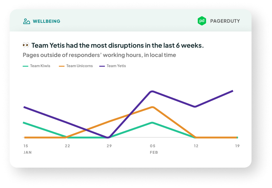
- What it is: The number of pages over time. You can see
Out-of-hours pages (the ones outside of the responder’s preferred working hours*, which can contribute to burnout), or All pages (includes pages during work hours, whch are still disruptive to a team's focus).
*By default, this is set to 8am-6pm weekdays, local time. Given that more and more people are working flexible hours, our metric is configurable for different timezones and different preferred working hours and days on each team member's profile in Settings.
You will need to integrate with PagerDuty to get this metric.
🌱 Coming soon to our OpsGenie integration - Why it matters: Being woken up in the middle of the night is never fun. Continued disruptions to sleep impact people's productivity, wellbeing, and satisfaction in their workplace. What's more, lots of pages disrupting a team (no matter the hour) can interrupt delivery.
- How we calculate it: We use the time of acknowledgement as a proxy for when the page was sent out (when the responder was disturbed). We count the number of acknowledgements on incidents, using the time that each
incident.acknowledged event occurs. We then compare this time to the responder's preferred working hours, and figure out if it was an out-of-hours page.
If multiple people acknowledged the incident on PagerDuty, the chart will count all acknowledgements. For example, if Person A acknowledges an incident, then reassigns to Person B who also acknowledges it, both Person A and Person B (and their respective teams) will have +1 to their Page Disruptions on this chart.
This metric is not available on historical data, because we don't have access to the incident's history of events. - What good looks like: Generally, the less pages means the more reliable your tech stack, and the less disruptions to workflow. If the number rises above 1-2, especially for out-of-hours pages, it’s important to ensure that it doesn’t become a trend so that people aren't doing sustained days of long hours and interrupted sleep. Multiple weeks of someone being paged out-of-hours might indicate some QA process changes or reliability work is needed.
Collaboration
PR Participation Gap

- What it is: This shows the absolute difference between the most and least frequent commenters on the team.
- Why it matters: This measure shows how imbalanced team participation is in reviews and comments. More balanced participation is a behavioral indicator of psychological safety, which Google’s Project Aristotle research showed is the number one determinant of team performance
- How we calculate it: We count the number of comments that each person has written and then show the range from the highest count to the lowest count.
- We exclude team members who wrote zero comments, because sometimes teams will have a few team members who are not on GitHub often, but included in the data.
- We can only calculate this for teams with at least 2 people; for a team of one person, there is no gap to calculate. - What good looks like: The smaller the gaps are, the better – a smaller gap means that people are contributing more equally. Looking at distributions of participation gaps each week across various teams and organizations, we found that a threshold difference of 25 comments would be a reasonably realistic goal for most teams.
PR Feedback Given

- What it is: The number of comments written on PRs.
- Why it matters: This visualizes who is giving the most support, since PR reviews and comments are a way to share knowledge and to encourage growth and learning opportunities. Giving feedback on PRs can be an example of glue work, the somewhat-invisible work that people do to lift up others on the team; our goal is to make this work more visible and valued on teams.
- How we calculate it: The total number of comments written on PRs, including comments on one's own PR. We include comments on your own PR because they are often in response to a reviewer question, so these can also contribute to learning and knowledge-sharing on the team.
- What good looks like: While written communication styles differ between individuals, if a team that does their code reviews on GitHub, then 10 comments per person is a good benchmark to hit. This is based on research from our own data, looking across 6 person-weeks of data for 10 randomly sampled orgs in the Multitudes dataset.
Note that the trends we expect will vary by seniority. Senior engineers are expected to give more feedback than juniors, to share their knowledge across the team. However, juniors have a lot to offer in code reviews too, via a fresh perspective and clarifying questions (more here about why it’s important to include juniors in code reviews). That’s why we still recommend teams aim for more balanced participation across the team – it’s always good to make sure that your juniors feel comfortable speaking their mind and asking questions during code review.
PR Feedback Received

- What it is: The number of comments received on PRs.
- Why it matters: Research shows that code review is important for knowledge-sharing and collaborative problem-solving; this metrics helps you ensure that everyone in the team is receiving enough support and feedback that they need. While this is crucial for juniors, continual learning and growth matters for seniors too. For an example, see this success story on how one of our customers increased how much feedback seniors were getting from their peers.In addition, there’s also bias in who gets good feedback. Specifically, people from marginalized groups are more likely to get less, and lower-quality feedback. This is why it's important to have data to make sure everyone on the team is getting the support.
- How we calculate it: The total number of comments written on the PRs that you've authored, excluding comments you've written on your own PR (since you don't give feedback to yourself).
- What good looks like: Similarly to PR Feedback Given, our benchmarks show that it’s good to aim for at least 10 comments per week to each person on the team. This is based on research from our own data, looking across 6 person-weeks of data for 10 randomly sampled orgs.
Also, there are nuances – for example, juniors might receive more feedback than seniors.
We recommend you use this data to focus on outliers. Someone getting very little feedback might not be getting enough support on their work. Someone getting lots of feedback might feel overwhelmed or could be the target of nitpicking.
Feedback Flows

- What it is: This graph shows how much feedback each person gave on other people’s PRs, how much feedback they got on their own PRs, and how feedback flows between people. If you have seniority set up, the graph will be color-coded by seniority, which can help you quickly see at-a-glance if feedback flows are as expected across your team.
- Why it matters: The top benefits of code reviews are improving code quality, knowledge-transfer, and learning. Moreover, there’s bias in who gets good feedback. Visualizing feedback flows can show us whether there are silos, and how we’re doing across the team at supporting each other.
- How we calculate it: We look at the number of comments and reviews that each person (or team) gave and received on their PRs. We then show how the feedback moves across people and teams.
- What good looks like: In the best teams, everyone is giving feedback and everyone is receiving feedback, or at least asking questions about others’ work. In these teams, seniors give plenty of feedback to juniors and intermediates – and juniors and intermediates feel comfortable asking questions to seniors.
We also look at several indicators of collaboration. In this bucket, we’re examining who gets support and who’s not getting enough support. We also show the people who are doing a lot of work to support others. This type of “glue work” is easy to miss but is important for team success and benefits the whole organization.
These metrics show patterns in comments on GitHub. To see review patterns, you can turn on the Show reviews only filter; this will show only reviews with at least 1 comment, rather than all comments.


